Crafting Imagery — Choose Your Own Adventure
Colin Dutton's wonderful article regarding "reading photographs."
This is a lovely article. This same article could be used to speak to graphic designers, user-interface developers or copyrighters. We get bogged down with the notion that we must skim; take at face value; judge and digest. More often than not I see, even my own child not allowing herself to see past what's being served up. My father, a fine artist, and I had endless discussions regarding abstract and representational work and what delivers a more 'direct' message. The point here (IMHO) is that if you allow yourself to go past the surface level, then the medium (w/e it is) can reveal more than its first impression.
A touch more than Symbology:
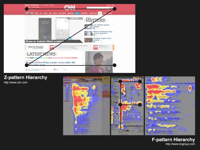
Here's a thoughtful presentation that discusses eye movement in design by author ANUJ MALHOTRA.
User interface follows many of the same directional philosophy as outlined in the article above. That said, you as the designer need to take additional care in delivering the "interactive" attributes to your user. This is where the "intuitive" nature of UI/UX come into play, and where many designers fall short.


